
We All code is a volunteer-run nonprofit organization that aims to offer free STEM educational resources and coding classes to underrepresented kids and teens from ages 7 to 17. The classes provide hands-on coding classes and teach web, game, and app development skills.
INTRODUCTION
MY ROLE
Research, design, validate, develop
THE TEAM
3 designers, 1 CEO
TOOLS
Miro, Figma, Visual Studio Code, and Github
TIMELINE
June - August 2021
THE PROBLEM
Currently, We All Code intake about 2-3 new volunteers a week, however, of those, about 80% only volunteer once. The intake process on the website lacks a clear UX flow.
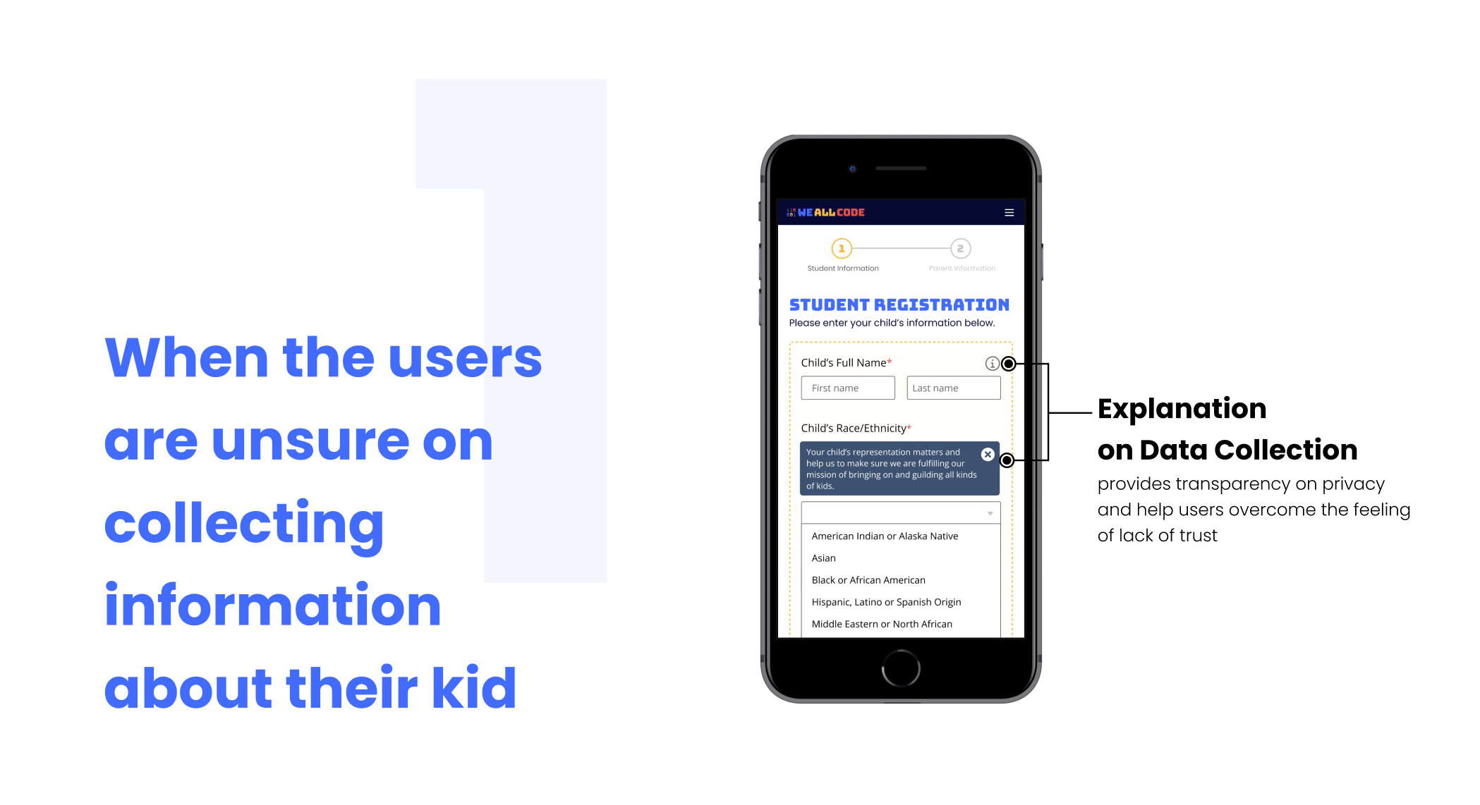
Additionally, the form fields for both parents and volunteers to complete prompt sensitive information about gender, race, ethnicity, and other data collection without reasoning and inclusivity.

THE SOLUTION


HIGH FIDELITY WIREFRAMES
PROCESS

Mapping out the current user flow
Users stuck in the loop of the registration step
Users could not sign up for classes for their kid
Users are not able to register more than one kid
Heuristic Evaluation on the current experience


Too many notifications display at the same time
Unsure which messages to read first
Unsure which messages is important
Visual layout is not consistent
Unsure which field is required and optional
Restriction on uploading a profile picture
Lack of explanation on why the information is needed
Unsure what the next step is

Overwhelming list of questions
Unsure which field is required and optional
Too many open inputs
Lack of visual cues
Stuck in the loop of registration

Understanding the needs
Research

Persona of a volunteer (left) and a parent (right)
Questions we asked during the user interview and think-aloud testing:
What are the reasons they sign up for We All Code?
What makes the abandon rate so high?

Journey map of a volunteer (top) and a parent (bottom)
visualize the process that the user goes through in order to accomplish a goal
understand how the user interacts with a service
discover the gaps and unmet needs from an existing solution
Analyzing different phases of the journey map to:

INSIGHTS
Lack of navigation is the reason users drop off
during the intake process.

Defining the solution
HOW MIGHT WE
create an intake process that provides users
with a simple and straightforward experience?
Design Principles
Clear and consistent guidance
obvious visual cues
simple instructions
transparency in data collection
confirmation and notification
language

Form layout should be one column
TESTING
The Result
the intake process completion rate increased by 300%.
helps people register as volunteers at We All Code much faster (5 min to 1 min)
parents can finish the student registration more effortlessly and flexible.

LESSONS LEARNED

Challenges we faced
Remote working can be challenging to collaborate
Conflicts can arise among teammates
with different work styles
Not enough time for research, too little
time to design
What people say vs What people do
can be different
Actions we took
Daily share-out and set a side time to work together as a team
Communication and trust within the team is the key - from Me to We
Research process is not linear, it can occur simultaneously with design
Actions speak louder than words - Usability Studies!

THE STYLE GUIDE

USABILITY TESTING


LOW-FIDELITY WIREFRAMES


CODE
